First I want to take a look at a character I was using years ago. The Dog With No Name. This is how he appeared in the 4 issues of the book Animal City ended up. Now I got to a point where I didn’t think it was working how I wanted it to so I stopped. I may try to rework the project or finish it at some point. Anyways here is the Dog.
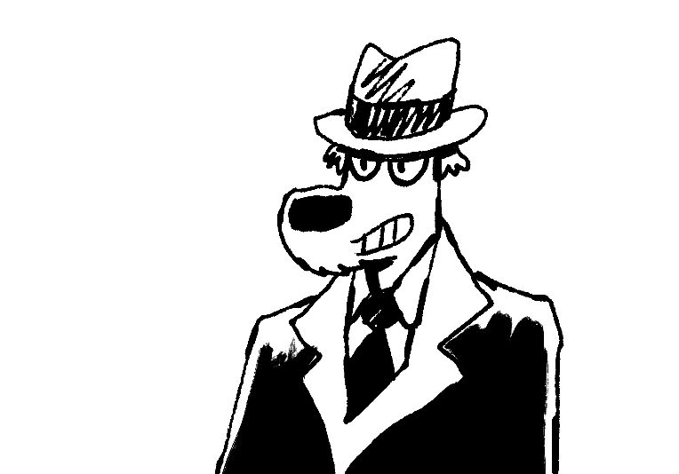
I think of design as having 4 points on a compass. This in no small part comes from Scott McCloud’s pyramid. He had photography/realism at one extreme. At another the picture plane/abstraction. And finally symbol/cartooning/language at the other. Eddie Campbell had a rebuttal of McClouds thoughts. It’s comics, just make comics! I take this as his putting personal expression at the forefront. So let’s play with this idea. First let’s move the Dog more towards abstraction a bit.
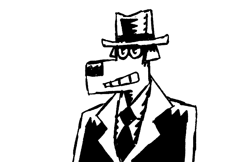
Moving more towards shapes. Let’s go a bit farther.
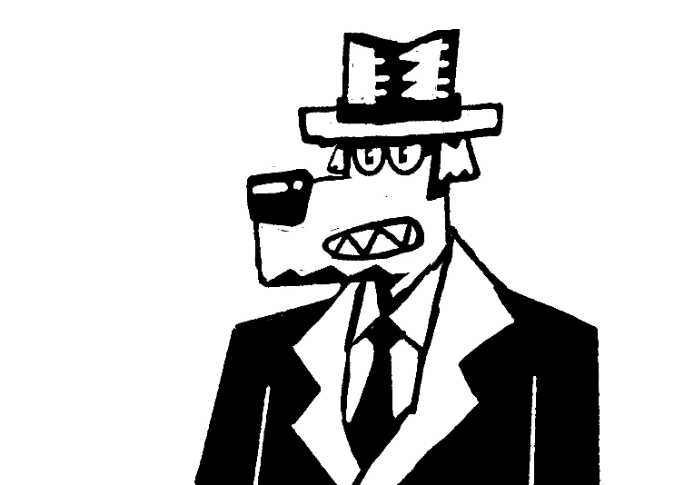
Cool, now he’s starting to look like a block print. Even farther toward the picture plane?
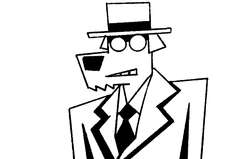
Yep. Triangles and trapezoids etc. OK Let’s get back to the center.
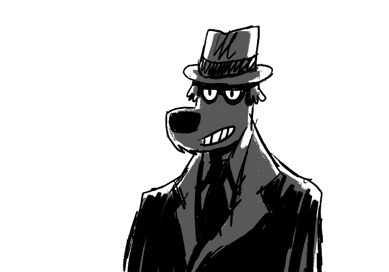
Here is another that looks more how I typically was drawing the dog. And I punched that up with a mid tone.From here let’s get more realistic.
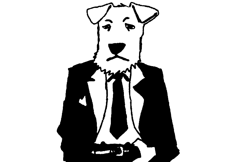
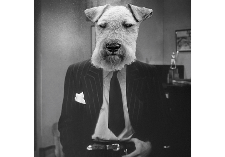
The way I normally draw the dog he really doesn’t look like a dog. I’m not saying I prefer this, but just to illustrate the point, let’s try a photo bash to go all the way to photography.
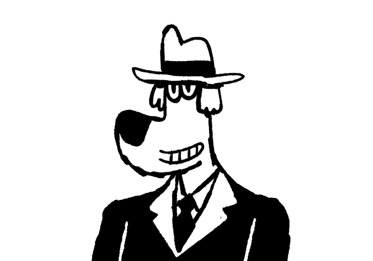
And lastly let’s go the other way and head towards cartooning even more than I normally go.
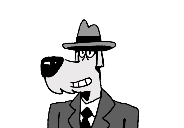
It’s a bit more streamlined. So I’m not doing this to say one way is better. I lean more towards abstracting and cartooning, Now I like this, but maybe it’s not expressive enough for me. I wanna feel it when I draw. So taking what I’ve tried out I’ll do one more and try to integrate the ideas while refining. And refocusing on expression.
Hopefully I refined the design, but at the same time not gotten bogged down with being slick. KEEP MAKING ART KIDS!!!